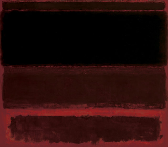
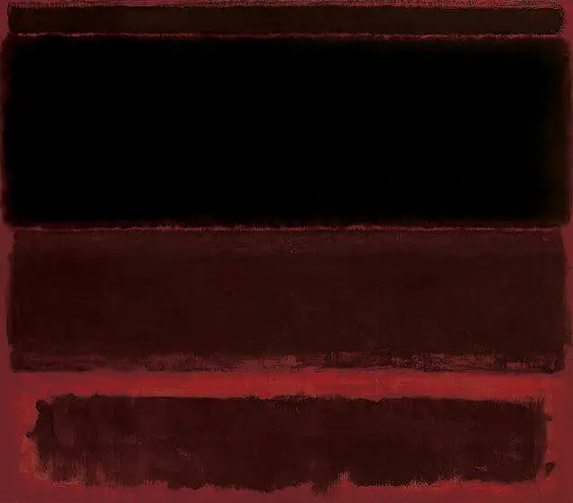
The red field against which the four dark forms float is first tinged with crimson, then with orange, then with brown. The lozenge shapes complement these shifts. The one closest to the lower edge of the canvas is a slightly blackened crimson. Moving vertically upwards, the next is darker. The large area of black is first shaded with very subtle tones of blue and then with green. These may not be noticed without seeing the piece up close in person. And finally, squeezed in at the top of the canvas there is a thin strip of a rather nondescript, umberish brown which seems to be holding all the rest in place. This is characteristic of Rothko's signature multiform style of blurred, lozenge shapes, moving horizontally across the surface of the canvas, which were created from using large numbers of layers of oil on top of each other.
Its meaning is difficult to comprehend, however it could be that, like Jackson Pollock, another Abstract Expressionist and contemporary of Rothko, the piece has no meaning in the normal sense of the word, but rather the painting is itself its own meaning. We do know that Rothko was attempting to represent human emotions within his Color Field period and that he also placed a significant importance on tones of red within his work. Thus, to experiment with different darker shades over a predominantly red background would be a darker version of earlier compositions. Previously, he would produce brighter combinations such as Orange and Yellow from 1956, just two years earlier than Four Darks in Red.
The artist is attempting to reverse convention here by placing darker tones at the top and slowly getting lighter as we move down the composition. This work is one of Rothko's larger, even by the standards of his Color Field canvases, measuring nearly three metres tall in total. The artist would carefully plan the ways in which each painting was displayed, desiring a scenario where people would be almost accosted by his work, with several sometimes placed close together so that no-one could escape the meaning and intention of his work. To see a single artwork placed on its own across a huge blank wall would have looked more like decoration, and would not have pleased him. It is not always the case for contemporary artists to take so much attention to the way in which their work is displayed, much depends on the style of this work and the meanings behind it.
It is believed that the decision to use darker tones was not just for the reason of signifying different emotions, but also to try to avoid the common misconception about his work being used for decorative purposes within galleries. He could not always control the way in which they were displayed, as much as he tried, and so this new darker palette could hopefully force paintings to be put on show in a similar way to his own taste. It was very soon after this painting that he started to work on his Seagram murals, which again marked a significant point in his career as he moved onwards from his earlier Color Field work. The layout of his rectangles would also change, as would the style in which he marked out the different shapes and how they interacted with each other.
This large canvas can now be found in the collection of the Whitney Museum of American Art in New York City and will normally be on display, such is the significance of Rothko's career within the 20th century art scene. They have an interesting and varied collection and also carry out a number of research projects based around the theme of American art, with a particular focus on the last two centuries. At the time of writing they possess around 25,000 different items across a number of mediums, with painting the main focus. There is also a good selection of drawings, sculptures and even film which represents the different work carried out across the 20th century. Although a large gallery, there is clearly a choice that needs to be made around which items are on display at any one time and so always check ahead if you are looking to view a specific piece.
When we examine the blurred edges of his trademark lozenges of colour, it is clear that Rothko has moved a long way from many of the other famous expressionist artists of the 20th century. He would not seek a purity of line whilst working in the Color Field movement, and instead desired a looser connection between the different elements within each composition. It was only later in his career where a clear separation was used, but that came after at least two decades of the approach that you find here within Four Darks in Red. He desired to create an experience, so each item of colour needed to be more related to each other. One can compare this to say the work of Kazimir Malevich, who produced very clear shapes within his work, as shown in the likes of Black Square, Black Cross and also Suprematist Composition. The relationships of those shapes were clearly intended to be much different to how Rothko was working here.


