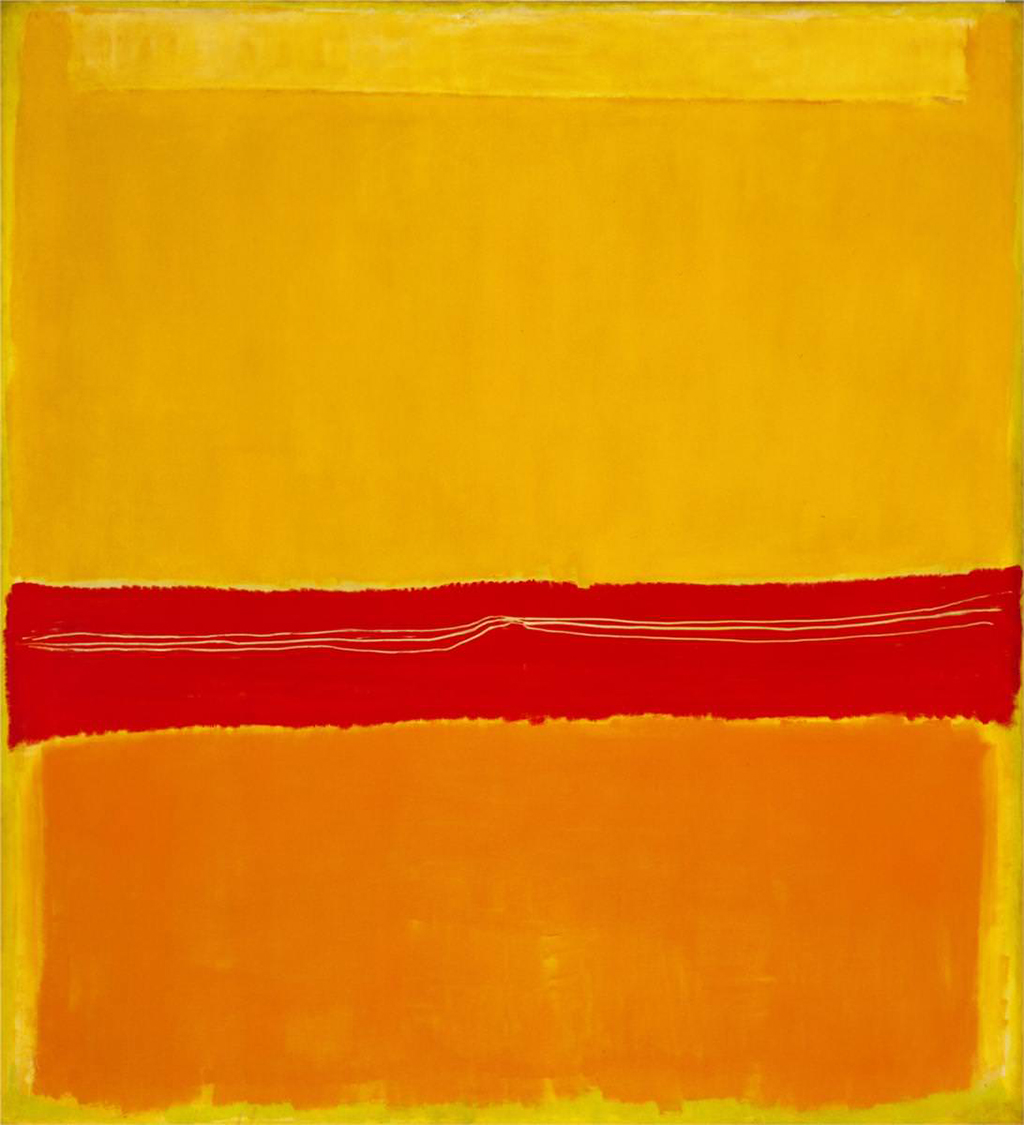
This particular artwork is fairly unique within the Color Field work of Mark Rothko. Here he gouges the tones of red with a blunt instrument which leaves sharp white lines across the full width of the piece. These look rough and spontaneous in nature, with around three lines completed, approximately parallel to each other. We do not see this often within his work, and so it makes No.5/No.22 an intriguing piece and we are left wondering quite why he chose to use this technique here. Whilst we are aware that he used all manner of materials and techniques within his rectangular shapes, many of which you will only notice if you view the canvases in person, up close.
Rothko threw himself head first into this new style in the late 1940s, and by the time of that this artwork came about, he was already starting to form an opinion on how he saw things progressing over the next few years. Bright colours dominated at this point and he was already aware that huge canvases were essential in order to get quite the effect he wanted. It was specifically that these paintings were taller and wider than the people viewing that was key here - in order to be enveloped in the intended experience, one must stand close and feel overwhelmed by the artwork in front. No. 5/No. 22 also had additional techniques for scraping which increased the interest that one would see in person.
The rectangles within this painting do not extend to the edges of the canvas and appear to hover just over its surface. Heightening this sensation is the effect of chromatic afterimage. Staring at each colored segment individually affects the perception of those adjacent to it. The red-orange center of the painting tints the yellow above it with just a bit of green. The yellow above seems to tint the orange with blue. Despite these color relationships, Rothko did not want his pictures appreciated solely for their spectral qualities, and he would go to great lengths in order to try to help the viewers understand his intentions within each and every painting. He is also known to have said...
"...If you are only moved by color relationships, then you miss the point. I'm interested in expressing the big emotions - tragedy, ecstasy, doom..."
Artist Rothko did not want to lead people by naming his paintings too specifically. That is why so many of his abstract pieces are either untitled or numbered. How No. 5/No. 22 arrived with this name, we are not sure - most likely is that various curators or researchers have assigned these two numbers separately whilst organising his career works and over time the two have been merged together into a name. This approach was used by countless numbers of contemporary artists, for much the same reason and that of Rothko. One exception to the rule would be Jackson Pollock, who would often summarise his drip paintings with just a few words, as shown with Blue Poles, Convergence and The Deep.
Some have claimed that No. 5/No. 22 actually depicts the outstretched arms of Jesus Christ on the cross. The artist himself described this painting as violent, and perhaps that it what he was referring to. Although Jewish, he had previously used Christian themes within his work and it is also possible that he was comparing the recent treatment of his own people with that of this iconic figure from the past. We do know that there was much thought in his abstract work, far beyond what others might initially have seen. He often focused on individual human emotions but this painting is different in the techniques used to produce it, and so it is possible that the meaning behind it was also different. We can also remember his later work for the non-denominational Rothko Chapel.


