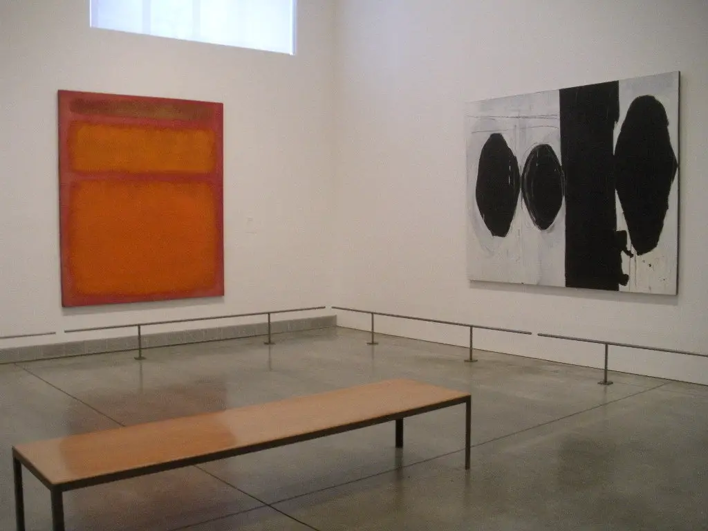
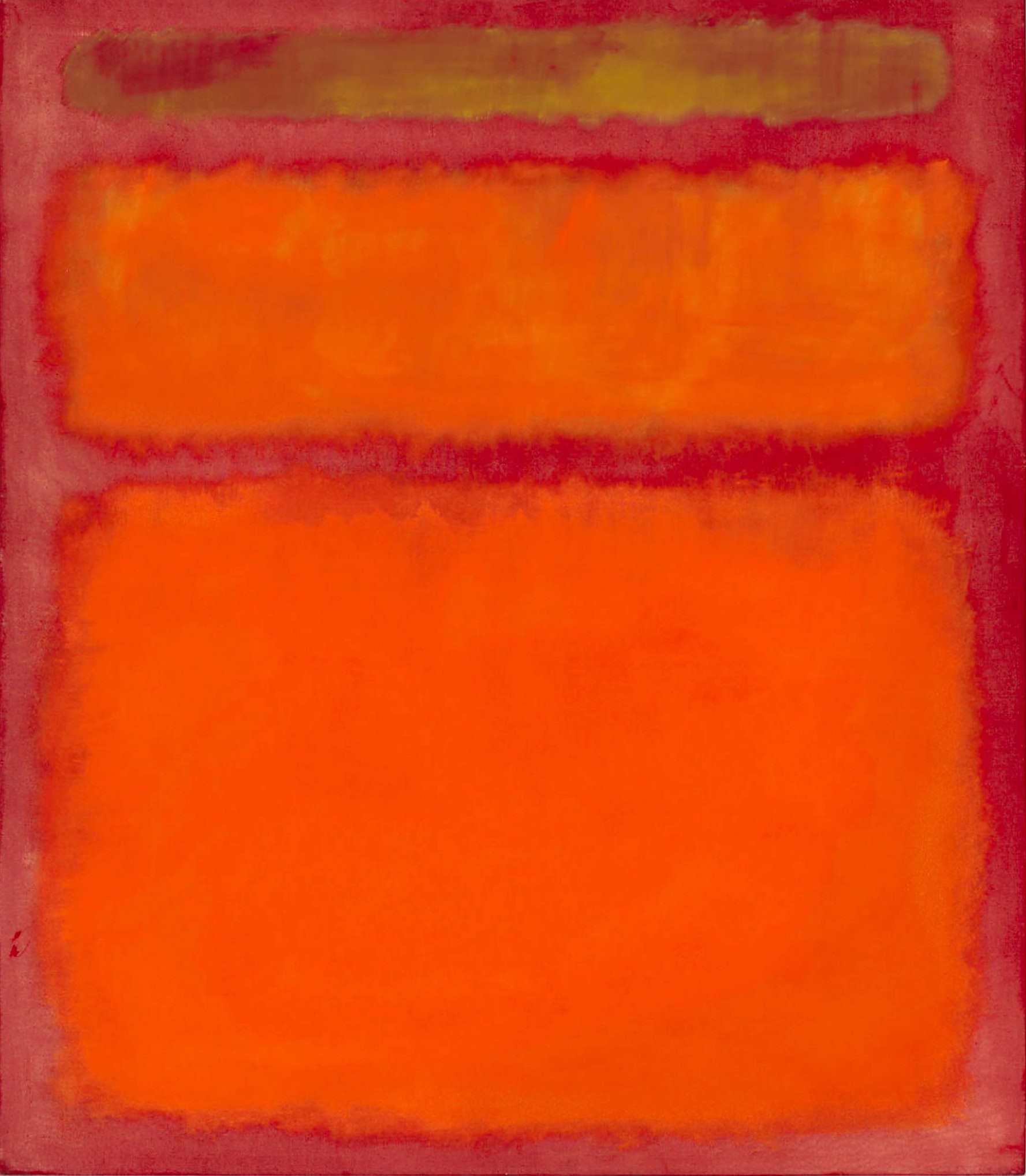
The rectangles within this painting do not extend to the edges of the canvas and appear to hover just over its surface. Heightening this sensation is the effect of chromatic afterimage. Staring at each colored segment individually affects the perception of those adjacent to it. The red-orange center of the painting tints the yellow above it with just a bit of green. The yellow above seems to tint the orange with blue. Despite these color relationships, Rothko did not want his pictures appreciated solely for their spectral qualities. He said, forty two years after his death, Marc Rothko sets records at a Christie's auction, which, again, has its own reasons to walk down the pages of history.
A brilliant camaraderie of three colors, Orange, Red, Yellow - Rothko's timeless creation from 1961, shattered all records for post-war and contemporary art by fetching $87 million. Rothko's record (surpassing the $72.8 million spent on White Center (Yellow, Pink and Lavender on Rose) in 2007) came a week after The Scream by Edward Munch became the most expensive artwork sold at an auction, ever. Contemporary art has seen a huge rise in valuations over recent years, with a truly global audience now competing for anything from the finest western artists of the 20th century. As oil rich nations attempt to diversify their economies with a great pull for tourists, so the prices of these paintings have continued to rise. Rothko himself is well served by a number of art institutions across North America and Europe, meaning very few of his artworks will now ever come up for private auction any time soon.
Rothko changed the colour schemes of his work during different periods but warm tones were amongst his most frequently used, with Orange and Yellow being another example of that. He would also use dark tones during the later parts of his career as well as experimenting with other colours such as rust, blue, and varying tones grey at different times. He wanted us to essentially walk into his paintings, to truly feel a part of them, and this is why he worked on such larger canvases. He would also carefully plan how they were hung at the various exhibitions in order to ensure that the correct experience was given to viewers. Orange, Red, Yellow was over two metres tall and wide, ensuring that is would be wider than most people looking at, enhancing their ability to drift into the piece, so long as they took enough time to do so. He was not an artist who could be appreciated with a brief look at his work.
The artist would rarely give particularly creative names to his paintings, particularly when working within the Color Field movement. Many were left untitled, leaving art historians with the task of finding ways to differentiate them for the purposes of documenting Rothko's career. Whilst catalogue rainsonnes will give a single code to each work to help in this process, this is not a suitable way for others to talk about different artworks from his career. That would lead to others appending the year to each work, and perhaps a selection of the colours used too. In the case of this painting, it was actually named as Orange, Red, Yellow by Rothko himself, and so it just about holds a unique title within his career. Whilst he used the same tones many times, this particular combination of colours is not repeated elsewhere in quite the same way.
"...Red is the color that fascinates Rothko above all others. No other color appears so insistently in his oeuvre from the time of the multiforms. It dominates Rothko's work of the fifties and sixties and, in fact, was the color of his last painting. Red is so potent optically that it overwhelms or obliterates other hues unless it is diluted or controlled by juxtaposing it, as Mondrian did, with equally strong colors, such as black and white, or the other primaries yellow and blue. But Rothko frequently uses it alone, altering its tonality according to the emotion he wishes to express. Perhaps Rothko was so drawn to red because of its powerful and basic associations: it is identified with the elements and ritual - with fire and with blood - and thus with life, death and the spirit. The Existentialist philosopher Kierkegaard, whom Rothko and his friends deeply admired, wrote movingly of red, in terms that call to mind Rothko's painting. 'The result of my life is simply nothing, a mood, a single color. My result is like the painting of the artist who was to paint a picture of the Israelites crossing the Red Sea. To this end, he painted the whole wall red, explaining that the Israelites had already crossed over, and that the Egyptians were drowned'..."
Diane Waldman

The artist uses a simple crimson tone to wash across the canvas before adding rectangles of of warmly coloured paint which act out his love affair with tones of red and orange. The yellow stripe at the top is small and absorbs colour from outside of the rectangle, leaving it dirtied. This allows the other rectangles to dominate the eye. By the time of this artwork, Rothko was really at the height of his fame and becoming particularly confident in working in this style. He would make use of this type of colour scheme most frequently during the last 1950s through to the early part of the 1960s. This period also produced his seagram murals plus also some for Harvard. It was a key period, where opportunities were continually coming his way, and all of the hard work from previous decades of experimentation was starting to pay off.

