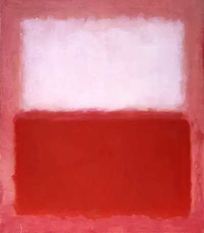
The artist hovers a mass of white paint over a red region just below. There is a small gap window the two areas, to allow each to breathe. The pink background shows through from between these two shapes, as well as across the borders of the piece. Many have termed his blocks of colour as lozenges and typically he would not allow them to quite reach the corners of the canvas. In later years Rothko would actually work on paper, and then place the piece on top of a canvas for hanging. He also moved towards a much darker palette in the 1960s, whilst with White over Red he was still very much in a brighter mood. In terms of sales at auction, it has been these brighter pieces that have often achieved more interest and higher valuations as a result, but there have also been a number of other factors that have also influenced valuations and prices realised as well.
Rothko became one of the most important members of the New York School and whilst being skilled in a number of different artistic styles, it would be his Color Field works that became the most memorable and influential. No-one had seen such a use of abstraction before, and the huge nature of the canvases also created an atmosphere and experience that made his work unforgettable for those who got to see his art in person. His reputation shows no sign of softening any time soon, and Americans continue to celebrate the significance of one of their own, having followed in the footsteps of European art across previous centuries.
This painting was produced by Rothko in 1957, by which time he had been working and developing this style of art for nearly two decades. It would become known as Color Field painting, and Rothko was the most famous exponent of it. He was an artist who wanted to diverge entirely from reality and produce forms that had no connection to anything in the real world. This would become a new type of artistic experience in which size and colour would be more important than precise detail, transporting visitors into a world where space took on a new dimension. There was a great desire to do something new across the 20th century, not simply recreate what had gone before, and been done so successfully. You will find similar in the careers of the likes of Miro and Mondrian, who gave us the likes of Carnival of Harlequin, Catalan Landscape, Broadway Boogie Woogie and Composition with Red, Blue and Yellow. They pushed further and further into abstraction as their careers developed over a period of several decades.

